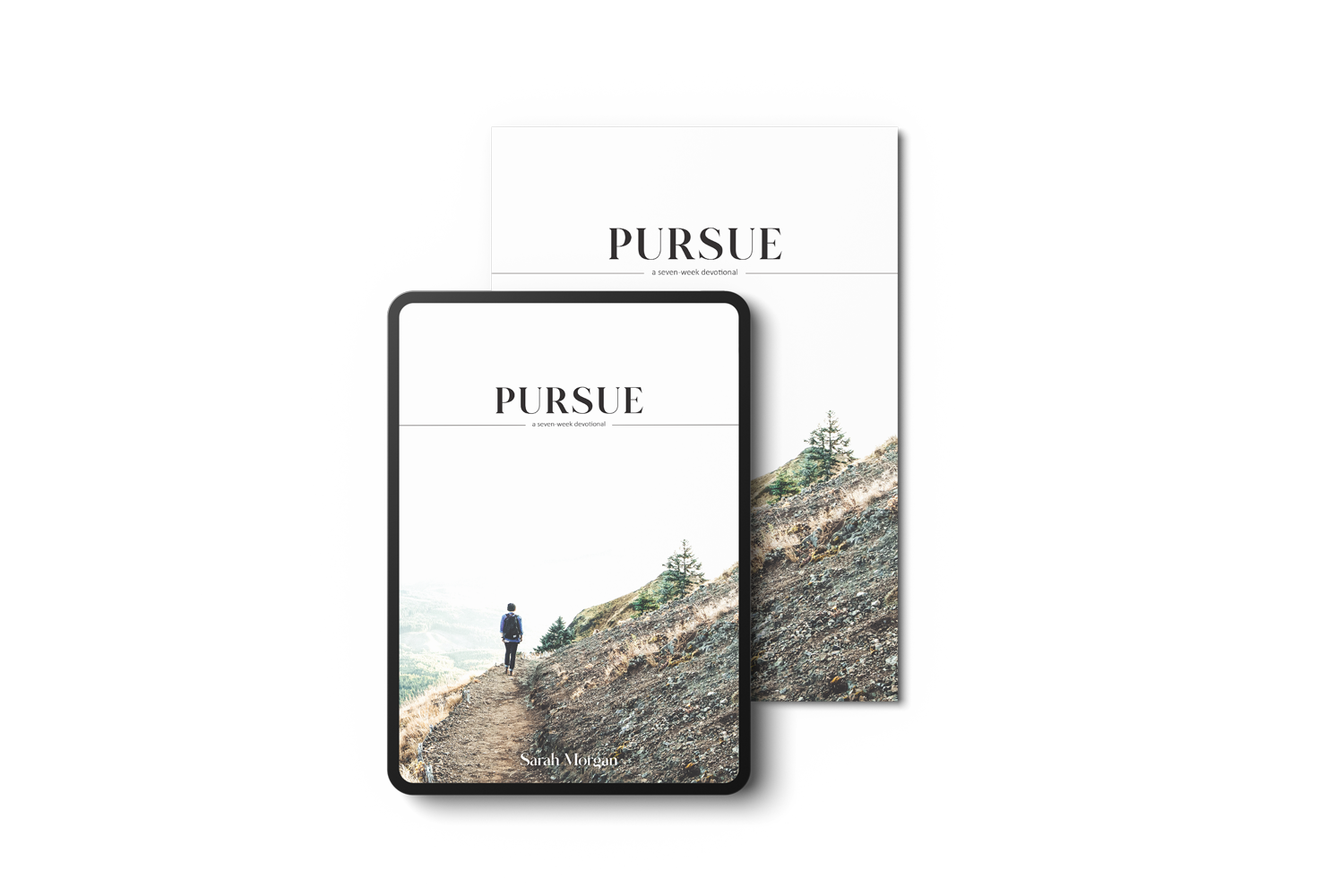
Pursue by Sarah Morgan
The Challenge: Beautiful content but a disconnected experience.
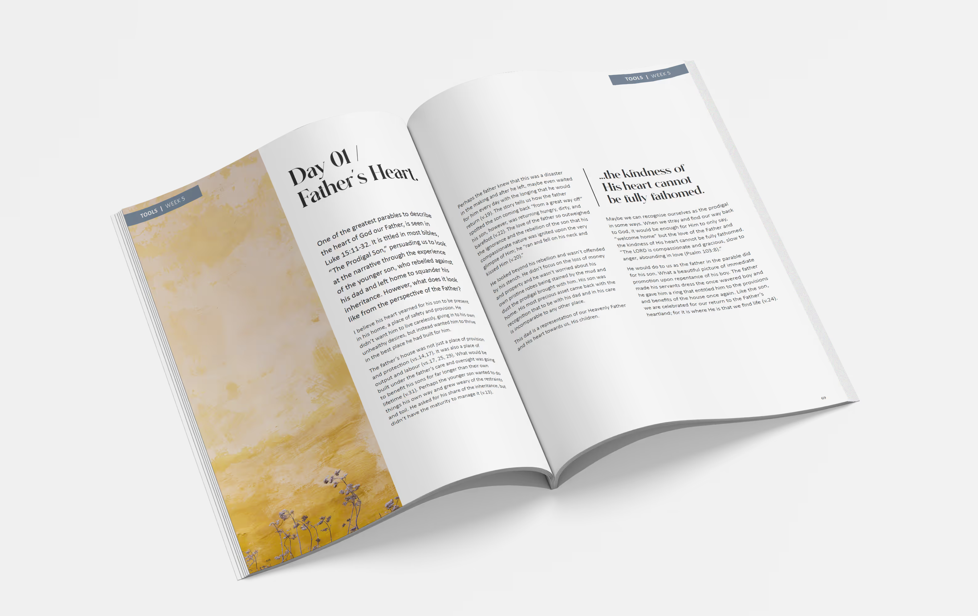
The Pursue devotional already carried a strong heart and message, but the editorial design didn’t yet reflect the depth and flow of the content. While the layout was in place, the user experience lacked cohesion. Navigation felt clunky, typographic hierarchy was unclear, and the overall tone didn’t align with the daily, reflective nature of the devotional.
The goal wasn’t to reinvent, but to refine; preserving what worked and elevating the rest into something that felt fluid, grounded, and worthy of the message it carried.
The Solution: Brining structure, flow and refinement.
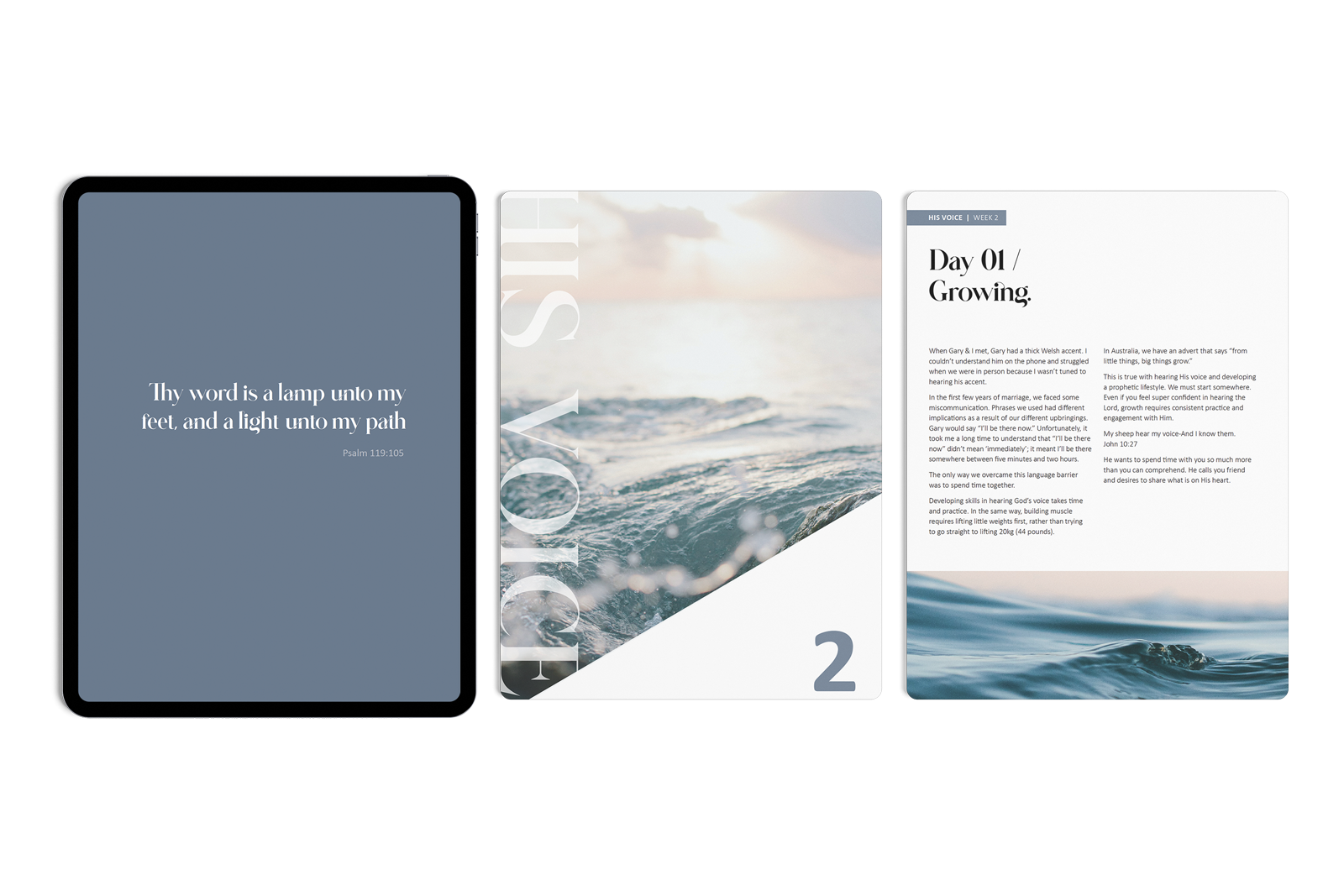
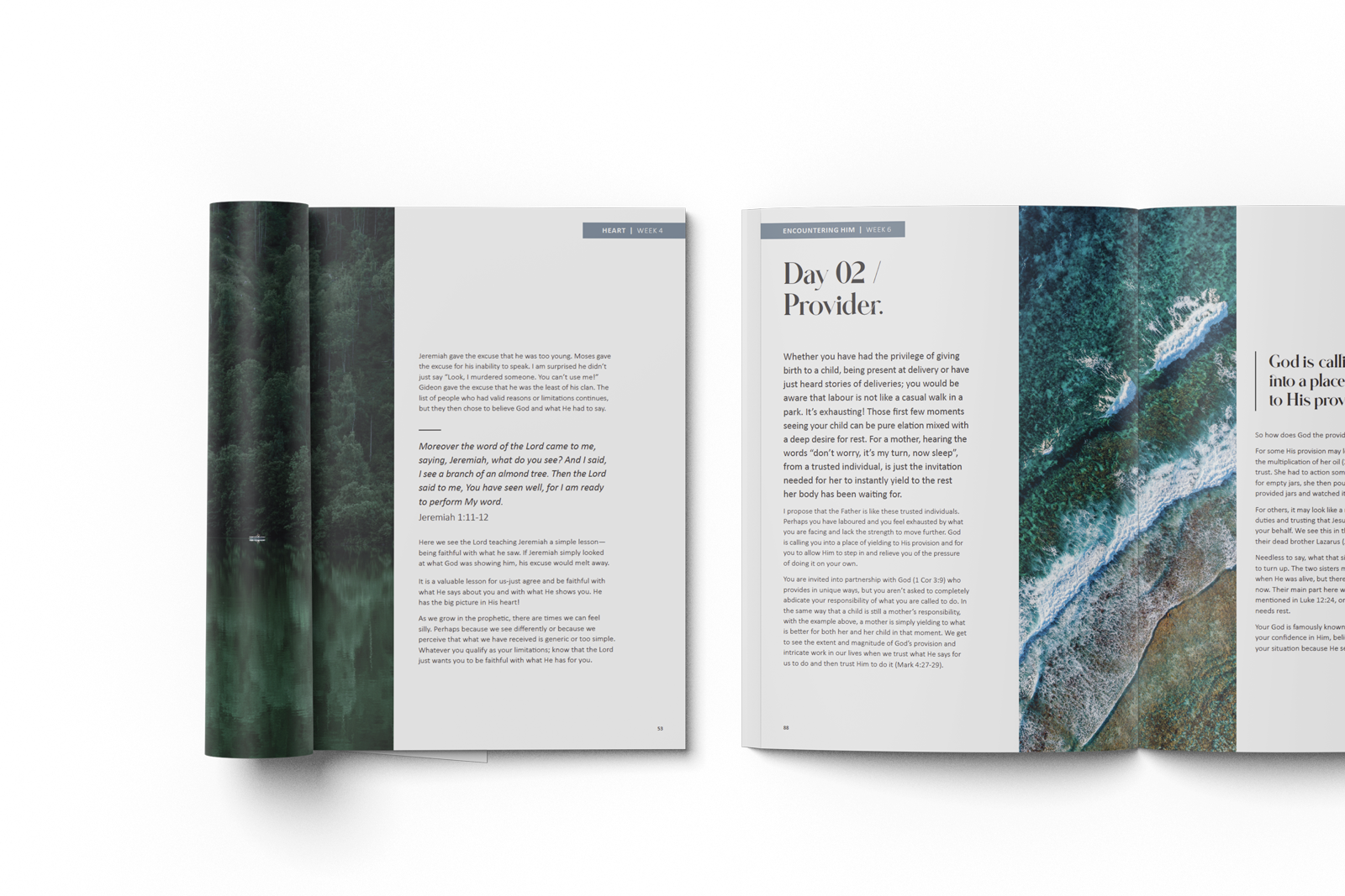
With the foundation already set, I stepped in to lift the project from good to exceptional. I refined typographic structure, introduced intuitive page navigation, and elevated the visual pacing to better align with the depth of the written content. These changes transformed the devotional into a more engaging and cohesive experience, quietly supporting reflection, not distracting from it.
- Introduced clear typographic hierarchy for improved readability
- Reworked navigation and layout for smoother daily use
- Enhanced flow and consistency across all spreads

The Results
An elevated publication design that felt consistent, fluid, and true to the author’s intent.
The final devotional now reads as effortlessly as it looks.
Subtle but strategic editorial design refinements improved clarity, engagement, and daily usability for readers.
Feedback described the outcome as a noticeable uplift in quality, without losing the author’s original heart.

Looking for creative that connects?
Let’s talk.


