MORE Conference
The Challenge: Designing from a deeper place of meaning and message.
The creative direction for the conference began with a collaborative planning session where a group of scriptures was selected to guide the message and general theme for the conference.
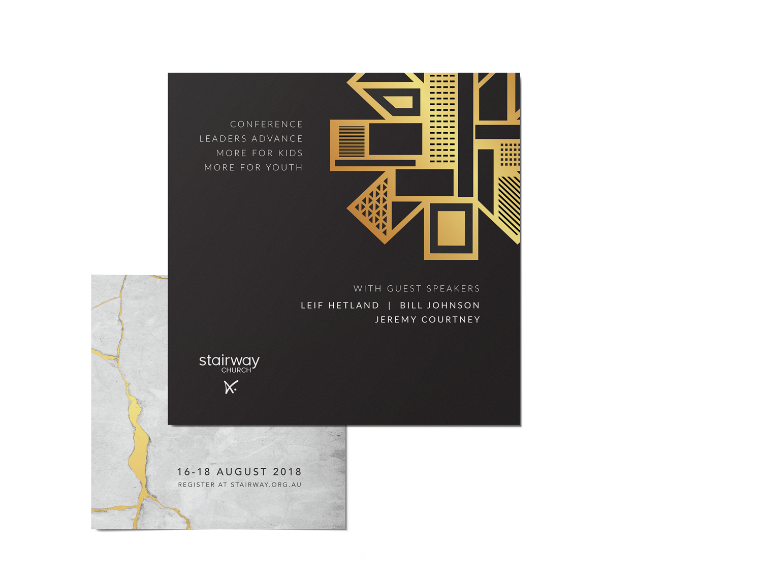
From there, I developed a visual narrative that wove together those spiritual themes. The concept of Kintsugi; the Japanese art of repairing broken pottery with gold became a powerful driver to reflect the ideas of restoration, healing, and transformation.
The task was to ensure that this metaphor shaped not just the branding, but the entire conference experience, from print to screens to the physical environment.
The Solution: Designing a theme that resonates with heart and purpose.
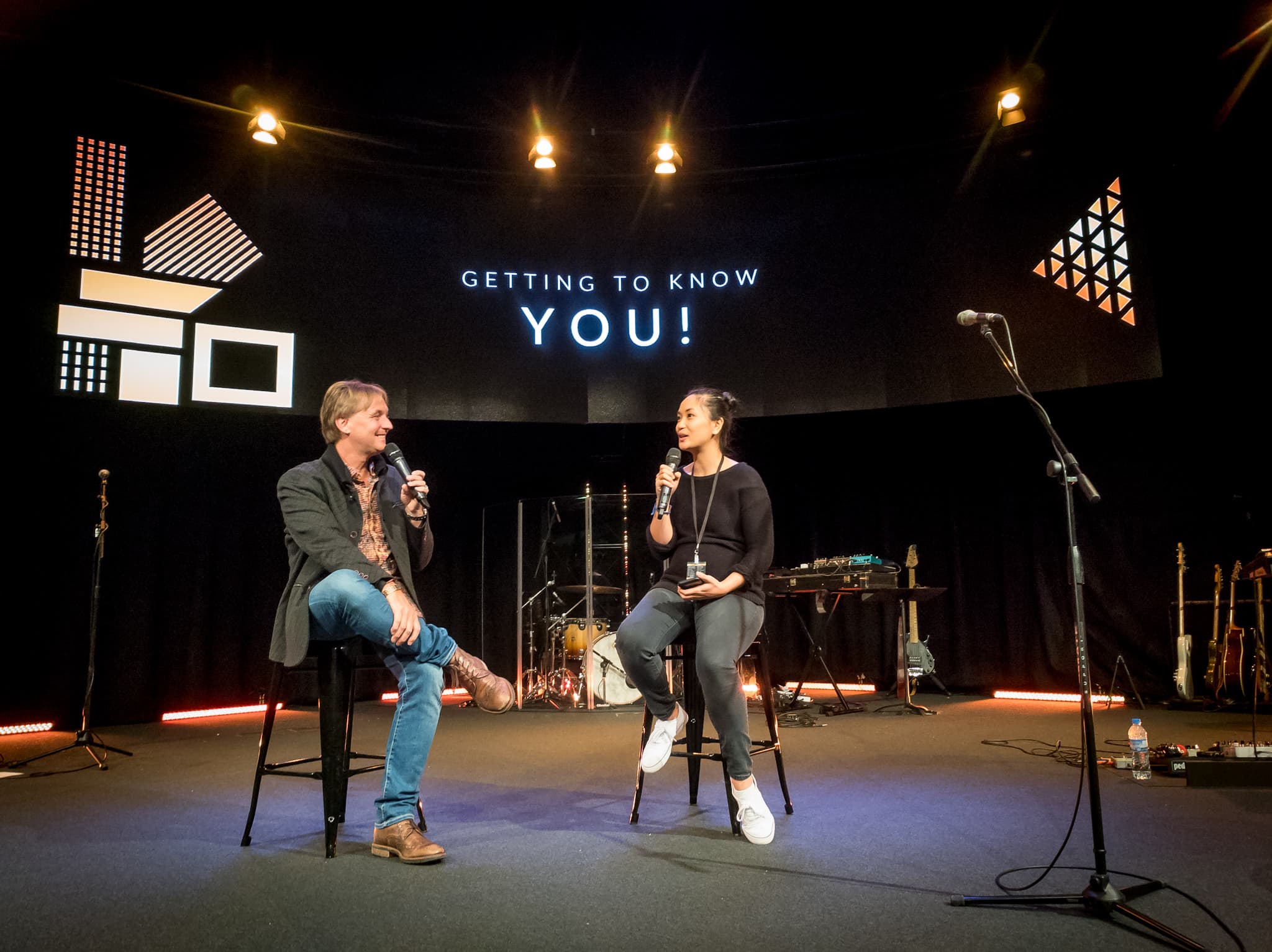
Drawing on Kintsugi (the art of mending with gold), I developed a cohesive experience design applied across print, digital, and stage environments. Attendees engaged deeply, with high participation scores, queues forming for sessions, and spontaneous worship breaking out (proving the power of a faith-based event branding system built for connection).
This wasn’t just about beauty, it was about creating an environment where every touchpoint supported reflection, connection, and transformation.


The Results
A conference identity that elevated connection, engagement, and the event’s core message.
High attendee engagement with interactive moments and tactile elements.
Consistent feedback praising the beauty and cohesion of the visual theme.
Aesthetic alignment helped spark deeper conversations among attendees.
Reinforced the event’s core messages without overshadowing them.

Mericia was a delight to work with in the creative presentation of our conferences in the period 2018-2020. This was evidenced by her attention to detail and her ability to pick what was truly important. It was most wonderfully expressed by her generation of material which then communicated the truly important aspects to a wide conference audience.
Looking for creative that connects?
Let’s talk.